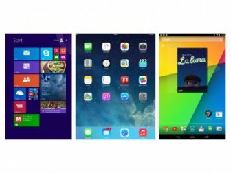
IOS vs. Android tablet

The last few years have seen some big changes in smartphone and tablet hardware; we've observed the continued decline of tablet sales, although they are still widely used by many consumers, and we've seen high-end phones not only introduce some interesting new advanced technologies (such as biometric scanners and QHD displays), but also a shift from the old plastic slab days into an era of refined, sleek metal and glass bodywork.
But above all that, the really significant shifts have occured, as they often do, in the software ecosystems these devices run on. Both Apple and Android fans have witnessed some big, bold, sweeping changes to their preferred platforms over the 2014-2016 period. Both the iOS and Android software platforms have had substantial facelifts, as well as key changes to how users view and interact with them, and the core feature sets of each setup has expanded in unique ways.
Android Lollipop was a BIG update for Google. The search giant completely redesigned the look and feel of Android under the banner of Material Design, creating a unified “Google Experience” across all platforms including PC, Apple and Microsoft products. Android Marshmallow, however, will be slightly different. First and foremost, it shouldn’t look too different to Lollipop. But where it will differ is in the back-end, which will be completely rejigged, making it tighter, more secure and more power efficient.
Android Pay also ships inside Android Marshmallow. This is why you’ll be seeing A LOT more Android handsets with fingerprint scanners in 2016. Beyond this, the update generally tightens things up, echoing similar moves Apple is making with its iOS 9 update, which launched in Q4 2015.
But it hasn’t all been plain sailing for Apple in 2016. The Error 53 debacle that it currently rendering thousands of iPhones useless is a BIG DEAL that Apple is currently in the process of “handling” though the company isn’t like to make an about fact turn as it has already said Error 53 is their for security reasons — and is not a bad thing.
Unaware of Error 53? Allow me to give you a quick primer: Error 53 basically bricks your iPhone 6 or iPhone 6 Plus if you’ve had it repaired by a third-party and not Apple. Apple introduced new software that will permanently disable iPhones during the software update process if it detects a repair has been carried out by a non-Apple technician.
No, really. And here’s what Apple had to say about it:
“When iPhone is serviced by an unauthorized repair provider, faulty screens or other invalid components that affect the Touch ID sensor could cause the check to fail if the pairing cannot be validated. With a subsequent update or restore, additional security checks result in an Error 53 being displayed. This is detailed in this Apple support article: . As the article states, if a customer encounters an unrecoverable Error 53, we recommend contacting Apple Support.”
Hmm. Anyways. You have been warned.
Here’s how Android M and iOS 9 stack up.
Android M vs iOS 9: UX Design
Android M and iOS 9 for the most part look identical. By that I mean both have home screens that support app icons and they also support widgets in their own ways. Both OSes also haven’t changed (visually) much this time around. Yes, there are some small tweaks in each (like the new font in iOS 9), but for the most part Android M retains the look and feel of Android L and iOS 9 retains the look and feel of iOS 8 and iOS 7.
Apple’s iOS platform is all about simplicity. Android on the other hand is more geared towards power-users and is infinitely more customisable - you can change almost everything about it and customise to your exact specifications. This is just cosmetic, however, but those looking for even more control can also root their Android device, relatively easily, and install custom ROMs like CyanogenMod. Apple users can jailbreak their iOS software too, though Apple REALLY frowns on this and it does void the handset’s warranty.
Beauty lies in the eye of the beholder - and this kind of works for design too. Personally, I much prefer the look of Google’s Android Marshmallow. Material Design was an awesome initiative by the Big G and it really shines through on stock Android, which you’ll find running on all Nexus and Motorola handsets. The overall look and feel is slick, fluid and well put together. The combination of detailed drop down menus, ease of sharing and the fact you can use third party apps as primary apps often gives Android the edge over iOS in many users eyes.
But for pure simplicity and a water-tight ecosystem it really is hard to fault Apple. For a pick up and go phone (or tablet), iOS provides the easiest route for many into the world of apps, games and content. Apple might have changed the look and feel of iOS in recent years, but its core functionality remains the same. The platform is intuitive, simple to operate and now links up very nicely with the company’s OS X computing software. Apple wants you to commit to its ecosystem and stay there, sort of like a religion, while Google is more agnostic in this regard, allowing users to access its services and content on both Android and iOS devices alike.
Android M vs iOS 9: Battery Life
I’ve said it a million times–no matter if its an Android phone or an iPhone–your smartphone is only as good as its battery. That’s because if your battery dies, your smartphone is useless. Many people think battery life is only a hardware issue. Yet the time your battery lasts can be greatly impacted by software. In both Android M and iOS 9 Google and Apple has created new features called Doze and Low Power Mode, respectively.
Doze is arguably the cooler feature. It uses a phone’s motion sensors to detect if it is being used or not. If not, Doze powers your phone down accordingly. Low Power Mode on iOS 9 doesn’t do things in that way, but it does provide users with a toggle to optimize settings to conserve battery life if you are running low.
Both are welcome additions to the fold to be honest, as many Android handsets — namely Samsung’s — have had low power mode features for a good couple of years now. Samsung’s in particular was AWESOME, turning your Galaxy S6 into a feature phone capable of lasting three of four days from around 20% battery life. Not bad for when disaster strikes!
Source: www.knowyourmobile.com
|
iXCC Element Series Apple MFi Certified 2 in 1 Dual Connector Lightning to MicroUSB Sync and Charge Cable for Smartphones & Tablets - 3 Feet (0.9 Meters) - Standard Packaging - Black Wireless (iXCC)
|
|
Anker Quick Charge 3.0 18W USB Wall Charger, PowerPort+ 1 for Galaxy S7 / S6 / Edge / Plus, Note 5 / 4 and PowerIQ for iPhone 7 / 6s / Plus, iPad Pro / Air 2 / mini, LG, Nexus, HTC and More Wireless (Anker)
|


